Um, so I did it.
I bit the bullet about 3 weeks ago, gave into my creative urges and bought the paints.
My lord but oils are expensive, I went ahead and got the acrylics. I bought a beginners set at first. Just red, blue, yellow, black and white, and invested my money in 4 good brushes.
Um, I got home, and was almost instantly frustrated. The pigments in this beginners set must have not been very true to hue, cause they mixed into muddy colors.
Ick.
And they did not lay on the canvas very thick.
So it was back to Texas Art Supply on Montrose for me within a couple of days.
This time I took a list of hues with me that a friend who had taken a class gave me. And I bumped up the paint quality to a upper student grade. Then the lady that was helping me told me about different additives I can add to the paint so that it lays on the canvas in different ways.
I rushed home of course.
I stayed up way to late on a school night.
I painted and painted, trying to recall as many details as I could from the Grain stack painting by Monet that I had seen in the: Monet, Renoir and the impressionist Landscape, at the Museum of Fine Arts Houston.
I'm happy with my little 12 by 16 rendition. It's not great. I think my old art teacher would be proud, and I guess for a first attempt it is pretty good. I do think my hues are too bold, I should have knocked back the values a couple of notches. The values in the Grain stack and the sky are too close together. The field is lighter in value, matching the values in the original more closely, but it has a flatness of perspective that I'm just not sure how to overcome. Although by the time I got to the field I had perfected the way that I was wanting to lay the paints down on my canvas, in thick, chunky textured strokes.
The bit of forest in the distance is just a little too crisp, I think it should be more of a suggestion of greenery, rather then being very recognizable as the edge of a forest. Maybe a couple more coats of glaze will tone it down a bit.
And the house in the distance, that seems to melt into the sky, well I think it is a bit to large for the perspective of the picture, and still is not quite melting into the sky as it should, as it did in the original.
The sky, the sky is my favorite part. A pointillist mish-mash of tints in cerulean, cobalt, and phthalo blue, with areas of magenta, egg yolk, purple, and green flecks to add interest. It is my favorite part cause I think I managed to most truly render an impressionist vision of nature with it, but still it's value is way to dark.
Next time I will use much lighter values overall in my work. While I know and respect deformities in perspective for adding interest, I will also keep a better eye on it. Especially how things lay on the horizon. For objects that I do not want to be the main focus of the composition I will mix grey into the colors to lesson their overall visual impact in the painting, and I will very the degree of values within the painting to a greater degree. Realizing that the sky in this first painting probably should have been a much lighter value to suggest a greater distance. Within the painting.
Well, Love to you all!
WE ALL FALL DOWN
 This icon is in the titles of entries with images. Most images are taken with my Nikon Coolpix 775 or Coolpix 8800. All image editing accomplished with my trusty Corel Photopaint 12. Pictures taken by the author are attributed as such. All others are attributed where able.
Site designed by Madrigle. All words are the intelectual property of Madrigle. Images are the property of Madrigle unless otherwise noted or used in the review of a movie or book.
sticky note.
(Tuesday, Jan. 12, 2010)
mispelled
(Thursday, Jan. 29, 2009)
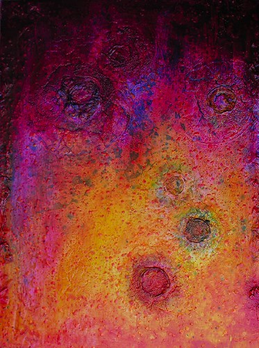
The Finger Prints of God.
(Sunday, Nov. 09, 2008)
Hugh Everett's Quantum Physics is tripping me out. Multiple Universes. Infinite multitudes of me me and you.
(Tuesday, Oct. 21, 2008)
It's like getten screwed with your pants still on!
(Wednesday, Sept. 24, 2008)
Once and Future favorite tunes